Login
You're viewing the assemblag.es public feed.

Replies

  • Oct 8, 2026, 7:26 PM

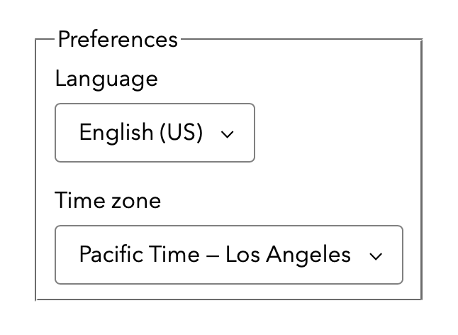
    I’ve thought for years the answer should be no styling! Be like a `section` or `div`. Let the developer turn it to anything.

    Thoughts?

    💬 4🔄 0⭐ 0
  • Oct 8, 2026, 5:44 AM

    @jensimmons IMHO the current style is pretty self-explanatory. The box needs a small touch over to fit the form elements. Rounded corners and bi would prefer the border colour a bit lighter.

    💬 0🔄 0⭐ 0
  • 💬 0🔄 0⭐ 0
  • Oct 8, 2026, 5:51 AM

    @jensimmons The current default style is pretty good already. The border-style could be “flattened” to match the input borders. Maybe add some border-radius, so the base appearance styles all fit together.

    But the underlying design choice of “box around related fields” gets the job done in my opinion.

    💬 0🔄 0⭐ 0
  • Oct 8, 2026, 6:06 AM

    @jensimmons Apart from the grooved border looking a little out-of-place next to today's more minimalist UI components, I think it still looks great. My absolute #1 request would be to have a standardized way to have a section heading cut a hole in a border like that instead of it being (AFAIK) unique to `fieldset`s.

    💬 0🔄 0⭐ 0
  • Oct 8, 2026, 7:31 AM

    @jensimmons The existing base style work pretty well in my eyes. The more important parts will be how `legend` can be positioned and how well the fieldset works with modern layout techniques (grid, flex etc.). That has caused problems for us in the past (not sure if Safari is to blame here though). But this weren't visual issues.

    💬 0🔄 0⭐ 0
  • SimonShepard@mas.to
    Oct 8, 2026, 11:57 AM

    @jensimmons Anything that makes the legend easier to style and makes it behave with the other content in the fieldset would be much appreciated.

    💬 0🔄 0⭐ 0
  • 💬 0🔄 0⭐ 0
  • 💬 0🔄 0⭐ 0
  • Oct 8, 2026, 7:56 PM

    Whoa. I admit I've come this far without really being aware of `fieldset`.

    I can appreciate that no default styling (like a 'div') is a less prescriptive, more Web-ish creativity-promoting starting point.

    But my initial reaction is that this default style is pretty darn clean and functional, in keeping with the Safari 27 default styling for `<select>` which you seemed proud of. (Why that and not this?)

    💬 0🔄 0⭐ 0
  • 💬 0🔄 0⭐ 0
  • Oct 9, 2026, 1:40 PM

    @jensimmons We’re probably a dying breed in the JS framework world, but when I first learned HTML, I was given the impression that the job of the browser was to make any valid HTML document passable.

    And then one *might optionally* use CSS to customize the style.

    With that in mind, the current style is… fine? I might nit pick that the border radius of the box is different than the controls, but otherwise it’s okay.

    💬 0🔄 0⭐ 0
  • 💬 0🔄 0⭐ 0
  • Oct 9, 2026, 4:56 AM

    @brooke We won’t change the existing system. We are inventing a new parallel reality. You’ll be able to apply `appearance: base` to any form control and step into a different world — where it all makes sense.

    💬 0🔄 0⭐ 0
  • Oct 9, 2026, 1:32 AM

    @jensimmons It might be trauma-residue from the pre-firebug browser-war days, but…

    - Fieldset should enclose everything — no border overlap. I’d prefer to omit the border entirely but maybe that is too radical.

    - Legend should behave like a heading contained within fieldset, identical to a heading within a div.

    - Legend would either have a font-weight that visually implies a heading relationship to the fields within the set. Or a font-size one step larger than the base- appearance for label.

    💬 0🔄 0⭐ 0
  • Oct 9, 2026, 8:24 AM

    @jensimmons Already been mentioned, but if you’re moving towards base styling that resembles a section or div, I think people would reasonably expect layout/position of legend to behave like other elements enclosed within a section or div.

    💬 0🔄 0⭐ 0