Oliver Blanthornbovine3dom@masto.ai
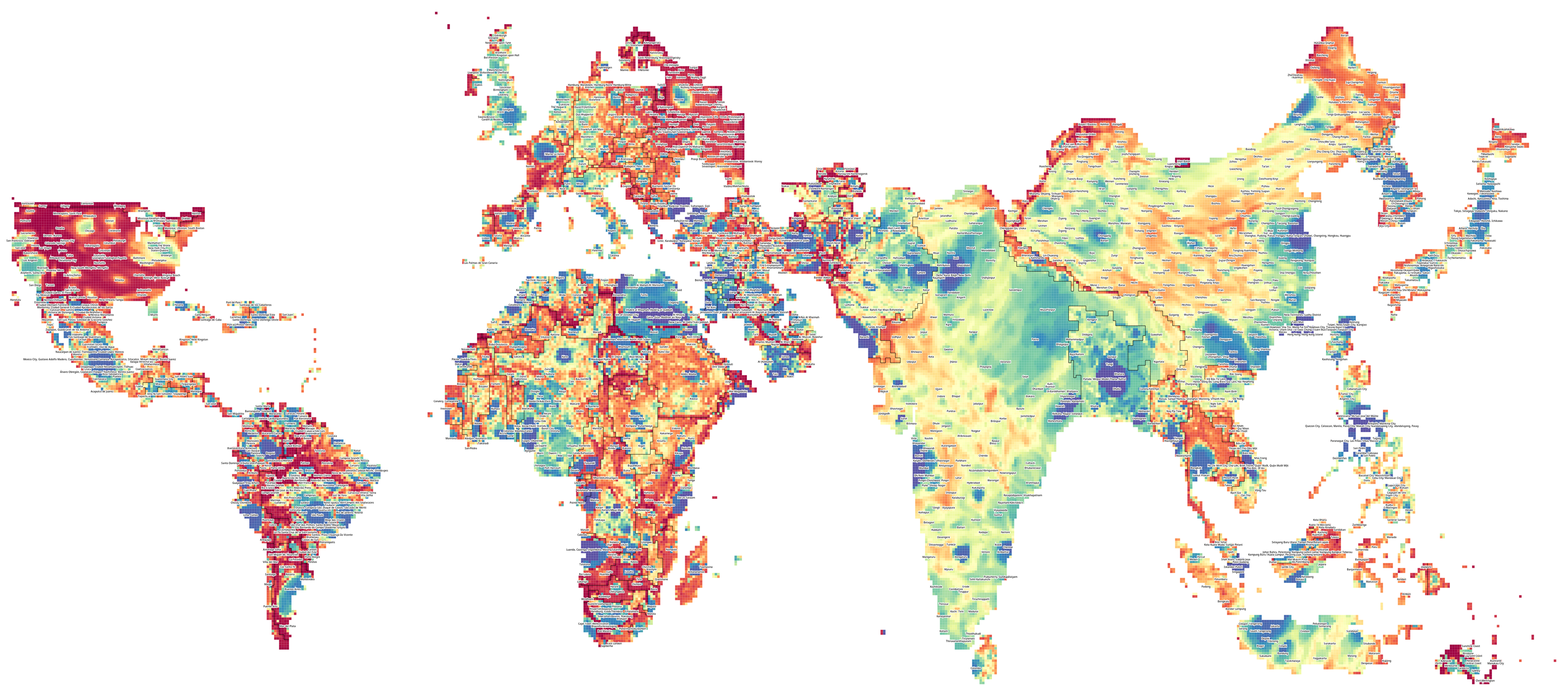
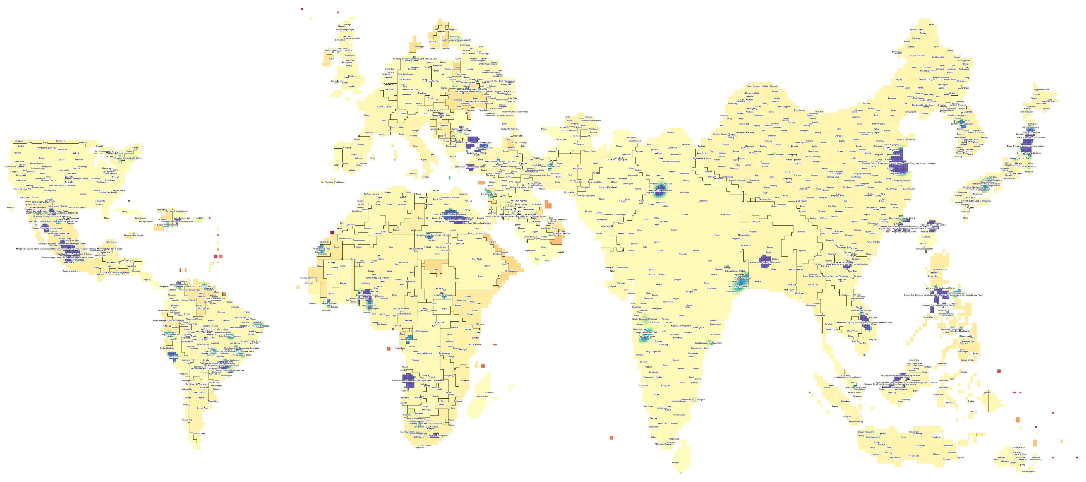
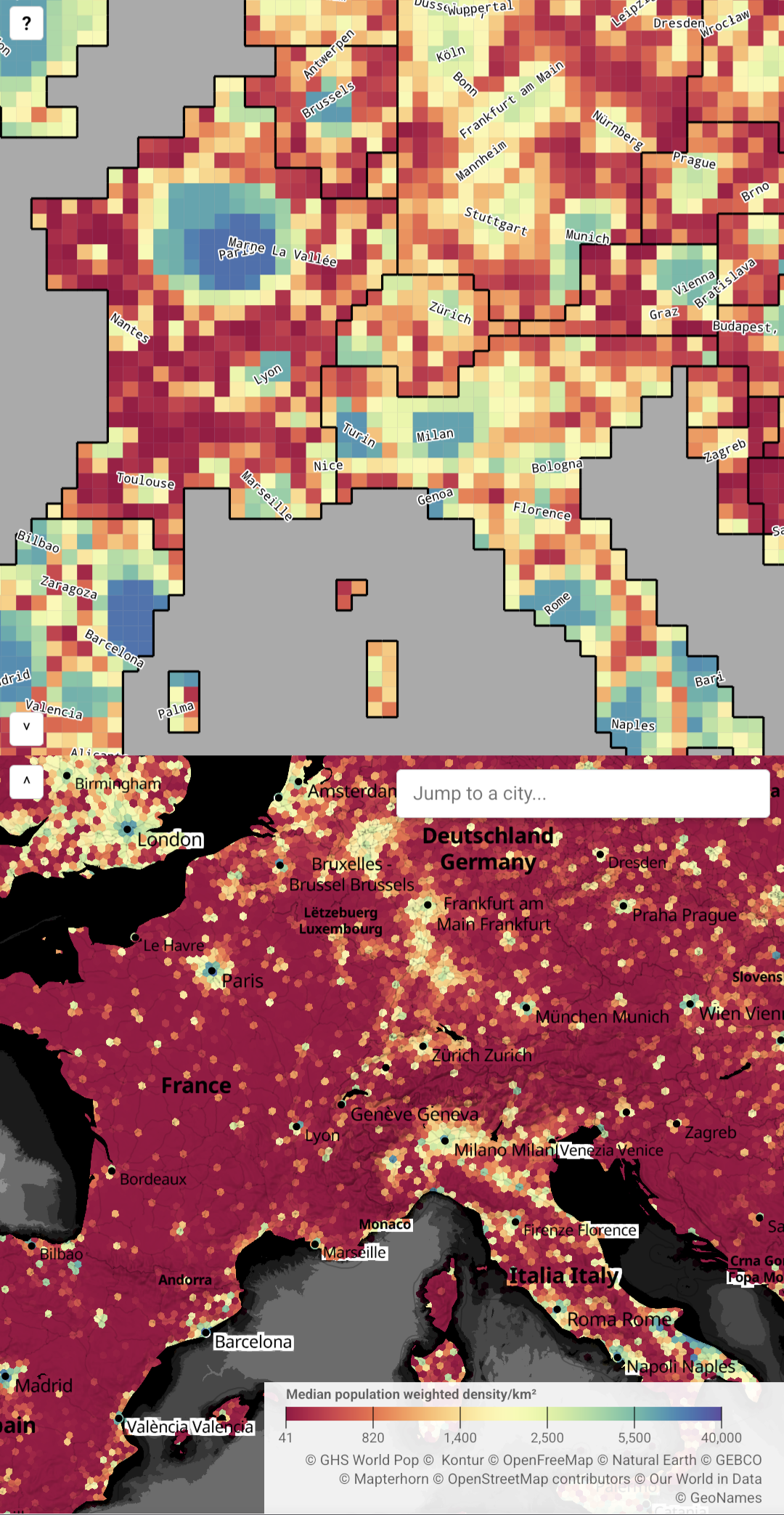
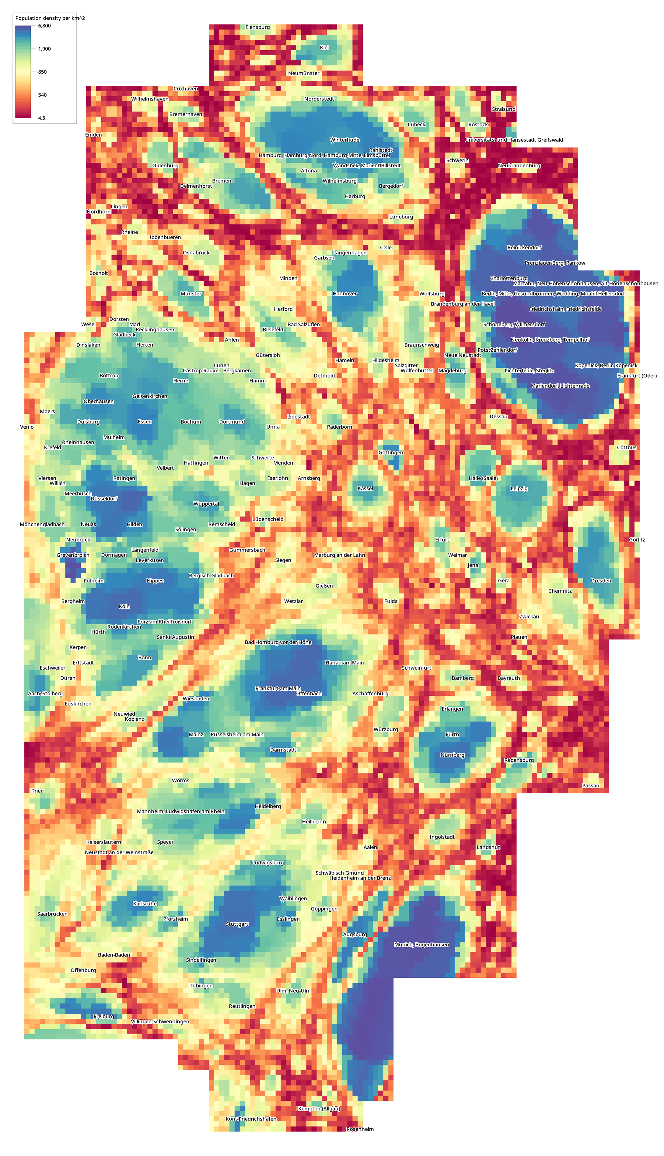
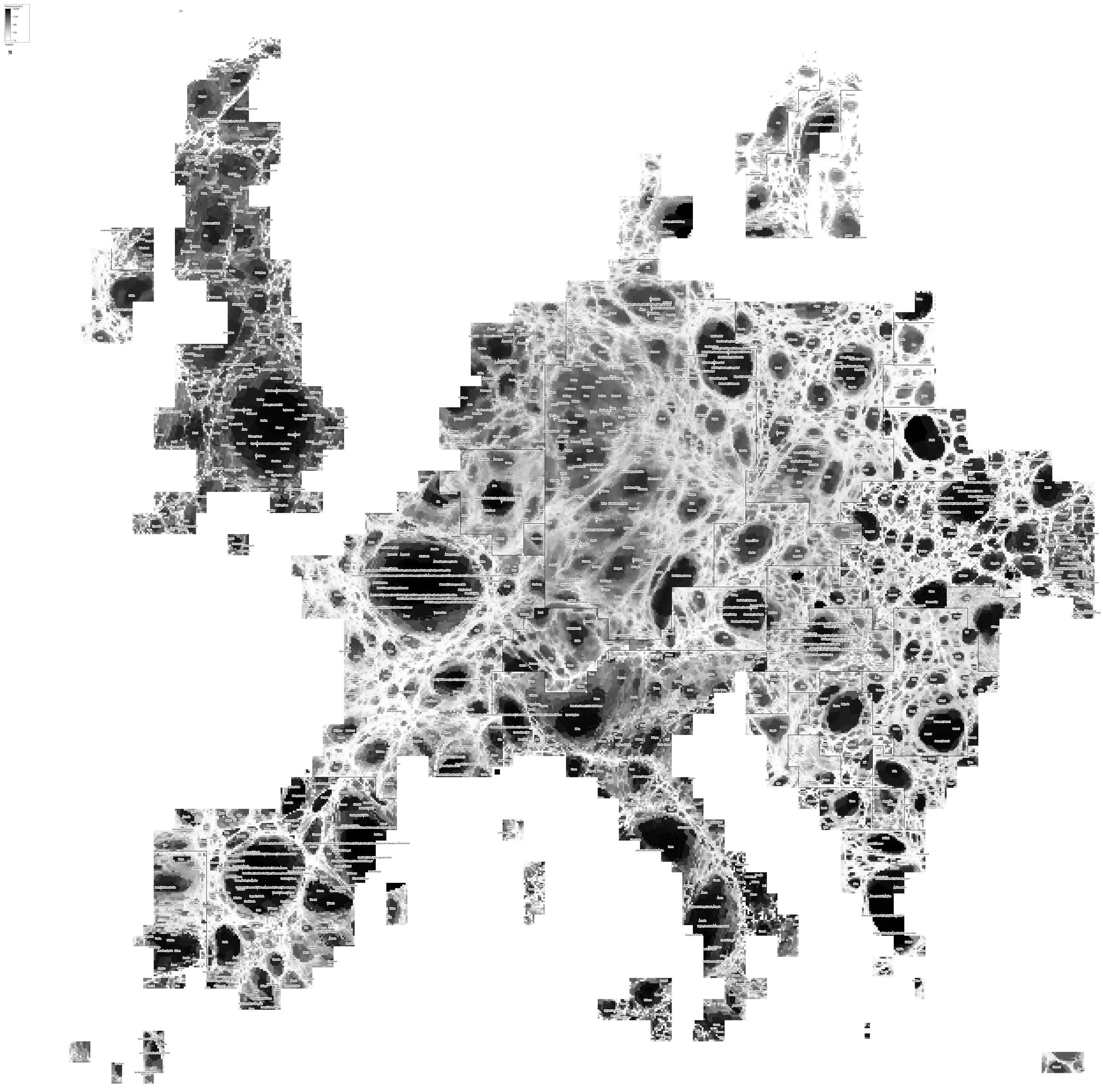
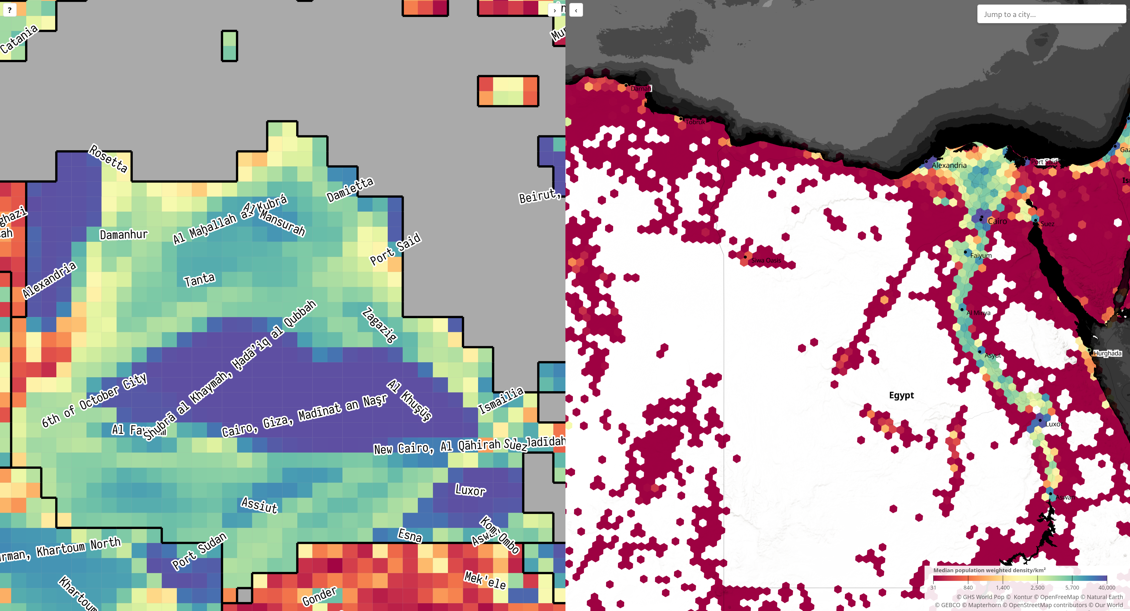
Jun 26, 2026, 6:10 PMmore progress on my uniform population projection maps. have fixed the holes in the previous ones
this is showing population density as experienced by people - every square is approx 150k people, and the colour of that square tells you the density they live at (blue = dense, red = sparse)
i particularly enjoy how you can see how unusual the US is - the only country that comes close in terms of sprawl is Russia
now the next job is to understand why the mapping has gone up from 2MB to 150MB...