
Stef Walterstephaniewalter
Jul 25, 2026, 7:41 PMI don't want to influence your votes but honestly the H proposal for the new European bank notes looks amazing!!
https://www.ecb.europa.eu/euro/banknotes/future_banknotes/html/design-proposals.en.html
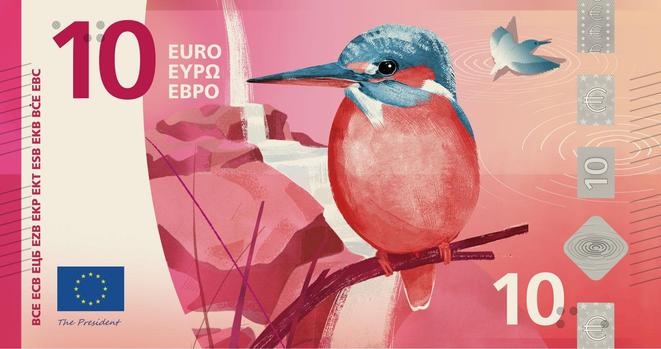
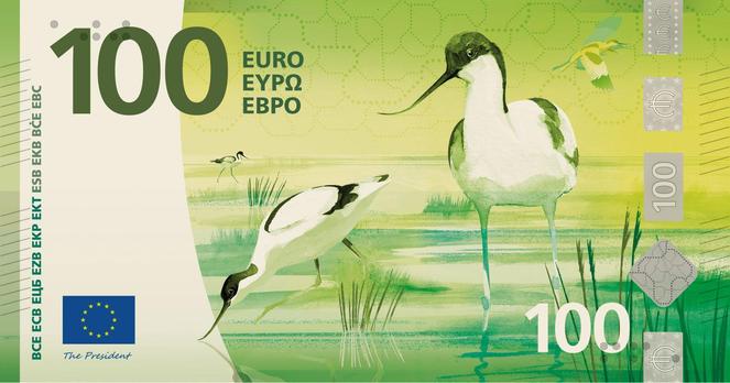
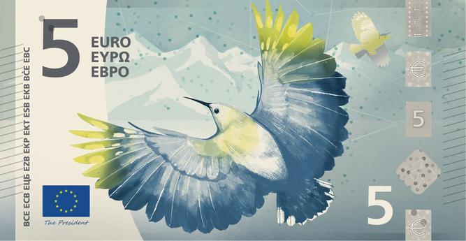
I don't want to influence your votes but honestly the H proposal for the new European bank notes looks amazing!!
https://www.ecb.europa.eu/euro/banknotes/future_banknotes/html/design-proposals.en.html

@stephaniewalter Do you know why they settled on either birds or people? Like, no other animals or anything?
@LilahTovMoon not sure but I assume there must have been votes before that for the themes?
I am kind of tired of seeing people on bills haha bring me the birbs
 Jul 25, 2026, 10:01 PM
@stephaniewalter @LilahTovMoon there was a public vote 1-2 years ago I think about what topics people wanted on the notes. I voted birds & rivers back then and really hope one of the bird designs wins this vote :)

@stephaniewalter I took the survey and "voted" for H as well, I love the 10€ note so much!
Jul 25, 2026, 9:57 PM@stephaniewalter that’s my favourite too! I hope so so so so much it’ll be the winner!
@stephaniewalter After looking at the options, I think there really needs to be a two-step vote: one, do you want birds + buildings or do you want famous people + education . (I love the birds, not so much the buildings. 🤷🏻♀️) Then for each content group, which design do you like best. It's a bit disorienting to be asked "who did it best" when half the group have a different design brief from the others.
It's also not fair that they're all shown in landscape when some of them are in portrait mode!
@AmeliaBR the survey is more like "do you like this or not" so I assume this will give grades for each? But then the second question about why is meh, like "none of the above"
 Jul 26, 2026, 5:13 AM
@stephaniewalter I prefer (i) but I totally get that a vertical layout can be jarring. H is nice.
@cpy I kind of like the idea thought because it's original. Everyone folds them anyway, right?

@stephaniewalter That is indeed a nice design, but I prefer the E proposal. It has a lot of symbols of living together.

@stephaniewalter "Designers from all over Europe have reimagined how they may look like" - on an official European website :-( "what they may look like" or "how they may look". Either or, but never both. Sigh.

There is a well documented "EU English" around the EU institutions: most speakers are not native, and bring quirks from their own native languages. A dialect of sorts
Many, law and bureaucracy terms imported from French and German, for example. And "odd" grammatical forms
Not unlike what happens in the Swiss languages, BTW
It's jarring mostly/only to native English speakers IME (of which, I should note, there are none in the EU: English is used for practicality)

@renatoram @jbouter @stephaniewalter
I suspect that many Irish citizens would point out that there certainly are some native English speakers within the EU. Not 'none'.
@tpuddle @jbouter @stephaniewalter oops, very sorry, I somehow forgot about Eire
And to think there's a long standing sympathy for Ireland in Italy
@tpuddle @jbouter @stephaniewalter maybe subconsciously it felt wrong thinking Irish spoke English 😁
@renatoram @jbouter ha as someone working for a European institution I can confirm. French and English are mandatory, but most of us speak English because it's easier for colleagues than French.
I'm sure there are plenty of grammatically inaccurate meetings/ docs but none bothers because, as long as we understand each other between the French designer, her Spanish colleague, the Brazilian PM with an Italian citizenship, the Romanian and Polish developers and the Greek stakeholder, we are fine 😁
@jbouter honestly English isn't my native language, I didn't even notice. Maybe you should let them know about the typo?
The birds are beautiful! But then it has the ugliest government buildings in Europe on the flipside, with the Berlaymont (European
Commission, in red) looking particularly like the Eye of Sauron!
Can’t we just combine the birds with the people/cultural activities?
 Jul 26, 2026, 9:38 AM
@Akshay @stephaniewalter this. I really loved the birds, but the buildings on the flip side :/ one of the bird series has more emphasis on the interior of the buildings so thought that that was the best, content wise, places for people to come together.
Yes, D is my conceptual highlight, with birds shown with the frequencies of their song, bird tracks, as well as hand gestures on the flipside symbolising what the EU institutions in those ugly buildings actually do