
Stef Walterstephaniewalter
Sep 2, 2024, 1:00 PMLooking for a monospaced pixel font with a lo-fi technical vibe, serving old school interfaces? Meet Departure Mono. I love it soooo much!
By Helena Zhang (https://www.helenazhang.com/)
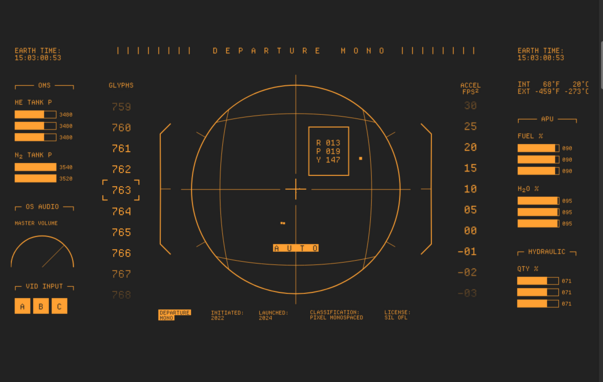
Looking for a monospaced pixel font with a lo-fi technical vibe, serving old school interfaces? Meet Departure Mono. I love it soooo much!
By Helena Zhang (https://www.helenazhang.com/)
 Sep 2, 2024, 1:02 PM
@stephaniewalter This looks so much like the font on my first PC, a zenith data system 8088 with an amber monitor, it's giving me chills.
@mnl Love a good retro dual color interface hehe

@stephaniewalter gee that's a beautiful website :cuteFroggie:
 Sep 2, 2024, 1:55 PM
@stephaniewalter@front-end.social whoa this is so cool

@Stellar @stephaniewalter another good one that's also available in different pixel sizes and very legible even at 7px is SGI Screen
it's an old bitmap font, a few linux distros still package it

@stephaniewalter that looks really pretty!
 Sep 2, 2024, 2:09 PM
@stephaniewalter@front-end.social it looks so sleek
Sep 2, 2024, 2:10 PM Sep 2, 2024, 2:18 PM
@stephaniewalter totally didn't just set this as my terminal font :3
@admin haaan that's actually a very good use

@stephaniewalter thank you. This is a lush font and I’ve the perfect use case.

@stephaniewalter niiice! Downloaded!
@stephaniewalter babes wake up new terminal font
 Sep 2, 2024, 4:43 PM
@stephaniewalter you!
I have two projects in which I have a task to look for fonts and this seems like a solid candidate for both. Thank you!
@stephaniewalter I've seen a lottt of font sites this is one of the best.
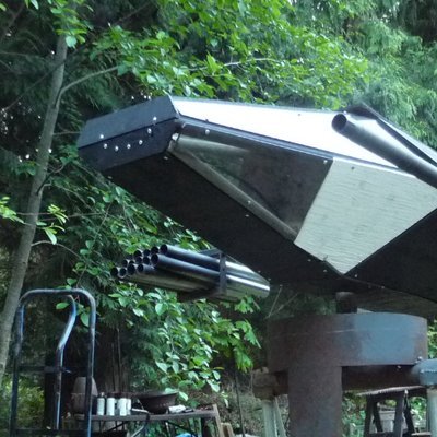
@stephaniewalter an impact font or an NTSC 5x7 font?
@stephaniewalter erp, haha, right got it now.

@stephaniewalter Huh. This is great. Thanks for sharing it, there's something I could definitely use this to improve.
@stephaniewalter
Ooh, bookmarked! Thanks for sharing!
@motorola68k
@stephaniewalter Appreciated. I was using one that's supposed to emulate the vt100 font but I find it too jarring to enjoy.

@stephaniewalter wow its beati... beauti... be... it looks really good!

To be honest, most of the x-height alphabetic uppercase section looks almost exactly like the ZX Spectrum system font.
(and the ascenders look a bit like Sam Coupe)
Of course I have to agree it's brilliant! 🙂

@stephaniewalter that is so cool
@stephaniewalter
Oooh thank you! Cool font and cool website, love it too!

This is a lovely font, and an excellent website.
 Sep 3, 2024, 12:03 AM
@stephaniewalter There's this fun breakout game on the page and I think I won :D
@stephaniewalter Not sure what system your running by toy might wan to check out cool reteo term as well. https://github.com/Swordfish90/cool-retro-term
@eliteamdgamer @stephaniewalter
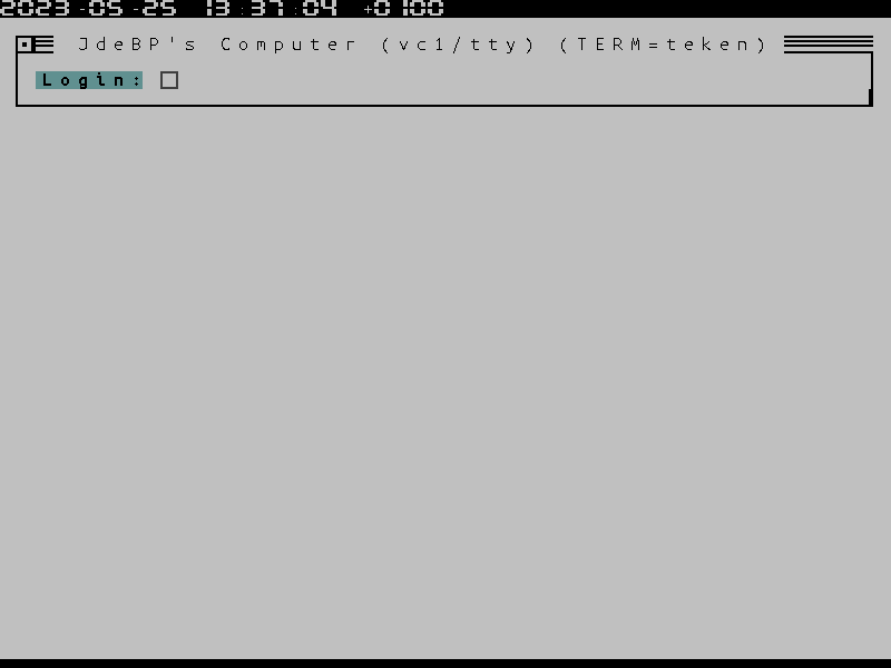
Authors really should say on the WWW page what their glyph coverage is, rather than have random incomplete examples. It would make my life easier, for one.
It turns out that Departure Mono has only 763 glyphs, which makes it rather limited if one's tooling does not support multiple font fallback.
Some of us in the modern world actually do put MouseText et al. to serious everyday use. (-:
https://jdebp.uk/Softwares/nosh/guide/terminal-resources.html#fonts
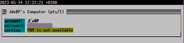
@stephaniewalter Looks just like the font on an FMS, love it :blobfoxwhoaa:
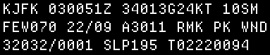
@stephaniewalter this is so pretty!! i love this aesthetic so much oml

@stephaniewalter HP 9807A vibes

looks like a PLATO screen

@stephaniewalter looks like that one found in msx machines ( https://webmsx.org/ ), also found in arcade machines like Space Invaders - i have no idea ho designed it
 Sep 10, 2024, 3:03 PM
@stephaniewalter That is LUSCIOUS
Thank you, using immediately

@stephaniewalter This, this, this! So lovely