
David Gerarddavidgerard@circumstances.run
Oct 20, 2026, 5:50 PMmastodon 5.0 regards viewing full posts as antisocial behaviour because
-- read more --
mastodon 5.0 regards viewing full posts as antisocial behaviour because
-- read more --
my psychic powers tell me our mastodon AI buddy scott jenson is involved. i have no smoking gun facts here, but it's the most scott fuckin' thing
 Oct 20, 2026, 5:51 PM
@davidgerard this is just like when lemmy decides that being up and not leaking memory is antirevolutionary behavior

@davidgerard I don't see that behaviour (which is a good thing) but I'm curious as to why 🤔
@Palleas i am suspecting our AI pushing buddy scott jenson


@davidgerard Not only do they put the -- read more -- in short posts, but they hide the right-hand edge by putting them into columns that are too narrow.
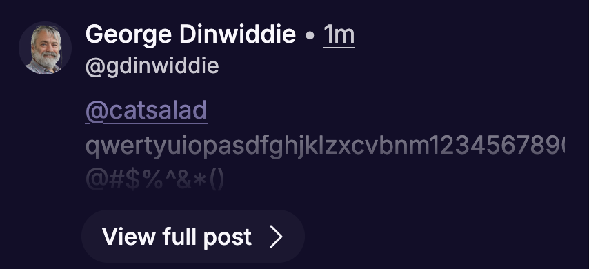

@gdinwiddie @davidgerard jfc, that's just downright user-hostile

@gdinwiddie @davidgerard It's a bug, put away the pitchforks and submit a bug report so we can fix.

@davidgerard This just in: Mastodon 5.0 drives clickbait headlines.
View full post >
.
.
.
.
.
.
.
It's 2026.
We're gonna go full LinkedIn formatting. Because we can.
Sentences?! Schmentences.
This is what clickbait headlines taught me about B2B sales.
@mayintoronto @davidgerard This post hiding behavior will get rolled back, mark my words. What an embarrassment

@liquor_american @mayintoronto @davidgerard I wonder if this is a browser or device specific rendering problem (error in `lh` overflow?), or if it's already been tweaked. So far I've only seen the "Read More" on longer posts in Explore, not inside reply threads (including the one someone else showed as an example in this thread).
Given the number of times I've seen entire blogs in my feed that are three pages long it has made me appreciate that the Phanpy client does this by default already.
@zimzat @liquor_american @mayintoronto "Claude, fix this render bug. Also, add more squircles."

@davidgerard @zimzat @liquor_american @mayintoronto The Mastodon team does not use AI.

This is fantastic to hear! My instance hasn't updated yet. I am eager to try out the #Accessibility @Gargron @davidgerard @zimzat @liquor_american @mayintoronto

@davidgerard My number 1 impression on first reload of the interface was "This is AI purple now"

@jripley @davidgerard@circumstances.run
The Firefox pornography tab colour

@davidgerard
when the referrals matter more than vision


@davidgerard As layout goes, my first impression was: what's with all the white space? Maybe slated for future ads?
All I know is a 1st year design student could do a better job with this, all things being equal. Which they appear not to be.