
Puppetheadpuppethead@ieji.de
Nov 16, 2026, 4:59 PM@mjd @simontatham When handwriting I tend to use the epsilon ampersand, it's easier. But this is pretty neat.
https://commons.wikimedia.org/wiki/File:Epsilon_Ampersand.svg
@mjd @simontatham When handwriting I tend to use the epsilon ampersand, it's easier. But this is pretty neat.
https://commons.wikimedia.org/wiki/File:Epsilon_Ampersand.svg
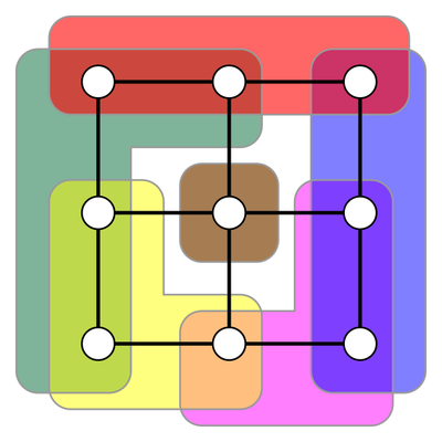
@puppethead @mjd @simontatham I used to handwrite my ampersands like that (epsilon ampersand) but then when they showed up in my lectures the students would never know what they were and I had to stop and explain. So I learned to write the curvy ampersand instead.

@11011110 @puppethead @mjd @simontatham I write "et" in cursive. I believe this is morally equivalent to an ampersand.
 Nov 20, 2026, 2:30 AM
@two_star Same. Mine looks like this.
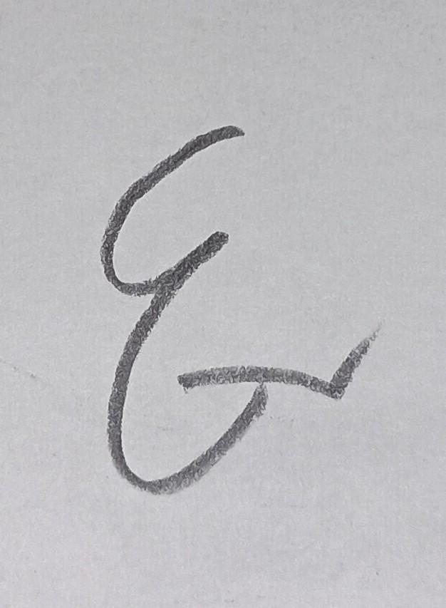

This is how I’ve always written them by hand. Though I have found that many (most?) folks don’t know about it.
As a designer, though, the traditional ampersand’s aesthetic can’t be rivaled. So I only use this alternative as a matter of practicality.

Is it, though? The epsilon ampersand I'm used to has three strokes, and that one on Wikimedia has four. The traditional ampersand has only one.