clifflecliffle@hachyderm.io
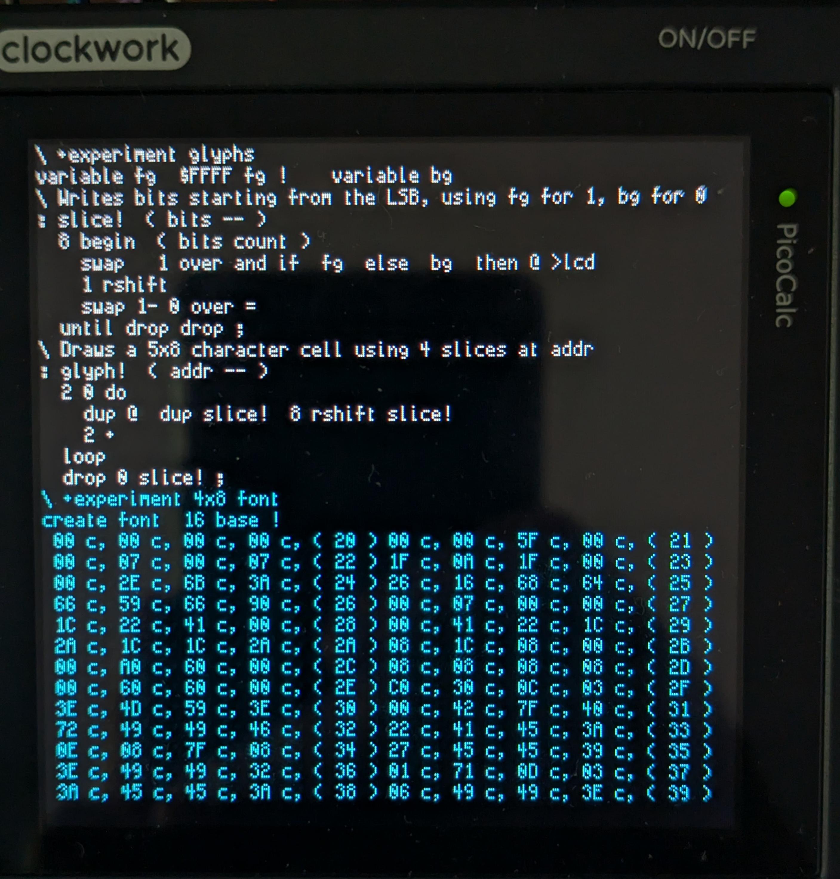
Oct 11, 2026, 6:12 PMOkay, this is decent. I have a habit of doing "high-waisted" capital forms to match high x-height, which gives the face a bit of a Charles Rennie Mackintosh vibe, but I feel like the 8 needs opened more to distinguish it from the 0.
This is a 16 bit color display, so there's no reason the default palette can't be Catppuccin. 😻
(Edit: goddamn I _always_ get Mackintosh's first name wrong by cross-wiring him with John Rennie of cast-iron fame.)