 Nov 17, 2026, 2:33 AM
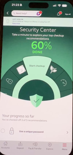
What a doofy “security” screen for a mobile banking app. This is what I get on the Wells Fargo app when I tap “security.” This just doesn’t seem serious to me. I don’t look at this and think “ooh. Here’s a bank that takes security seriously.” I think “here’s a bank that is trying to make things cute without making them easy to use or understand.”
For example, it sure looks like that dark green ring is something I might rotate by dragging my finger. No. It’s just decorative. The “start checkup” button is the active element.
The other thing I find jarring is the green. Wells Fargo’s color palate is red and yellow. So I’m on this green screen that looks nothing like anything else anywhere in the app. It wants me to look at alerts I have set up. It takes me to another part of the app that has the traditional red and yellow. It doesn’t even look like I’m in the same app. Does nobody think about design any more?