Login
You're viewing the discuss.systems public feed.
  • Oct 5, 2026, 11:17 AM

    I just got a shock. I want the old design back!!! 😭
    It was a matter of seconds, and the Design of #Mastodon changed.

    Usually, I have nothing against design changes. But if it hits me so unprepared that I think my browser has a bug ...
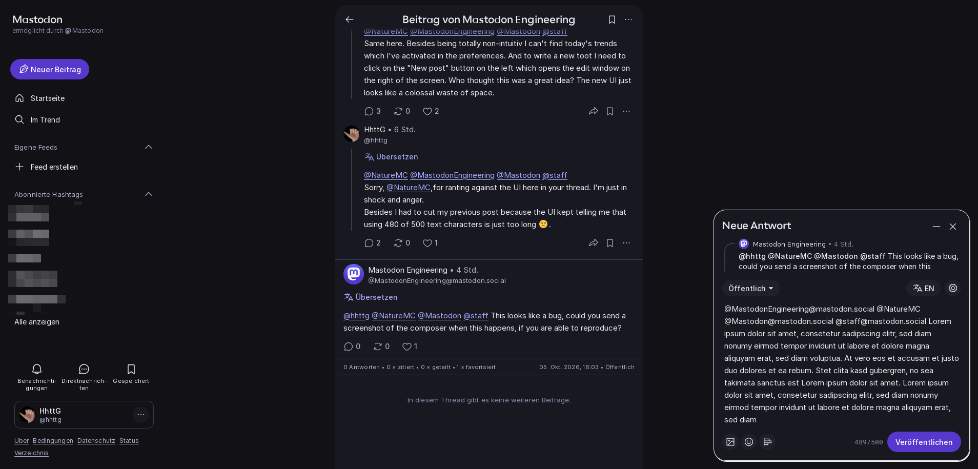
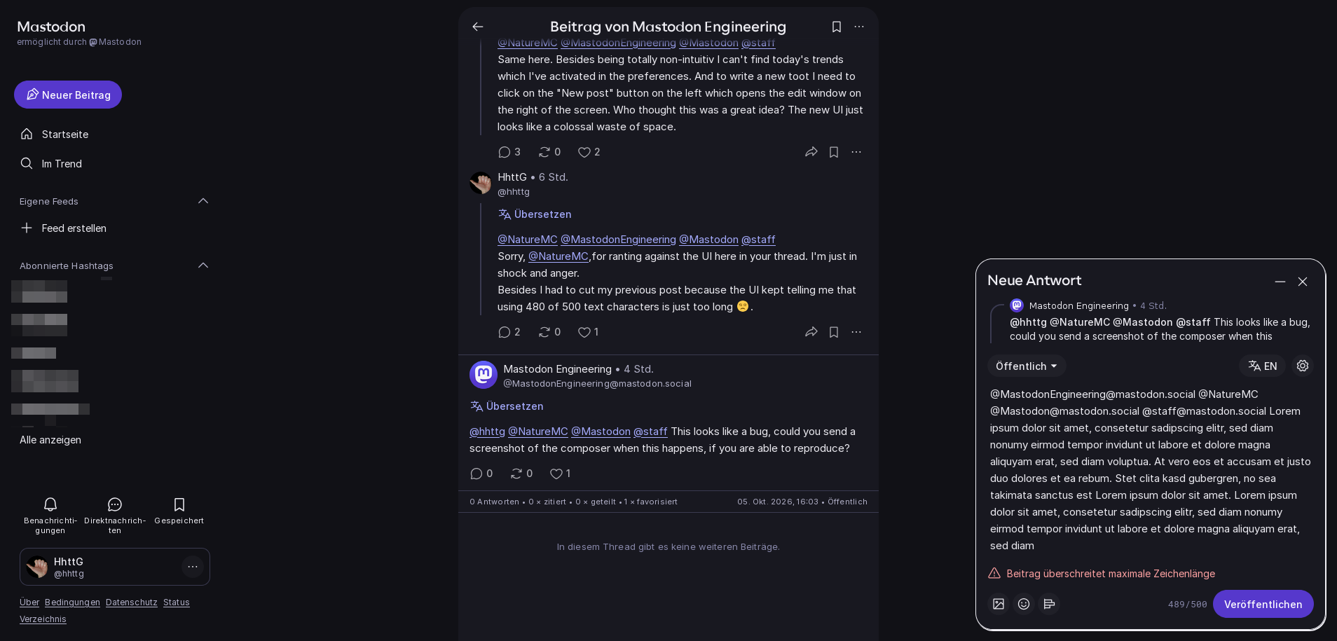
    A real bug is that I have to make an extra click for writing a post now and get a much too small pop up field down at the right (not at eye's height)! I have to search for notifications ... it's less intuitive than before.
    @MastodonEngineering @Mastodon @staff

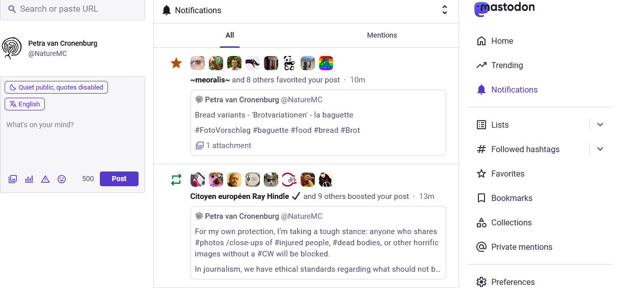
    Old version seen at notifications: the feed is dominant. At the left, the post field. The menu at the right. Everything is visible, readable. The bigger posting field is at eye's height. All icons visible evenfor people with glasses!
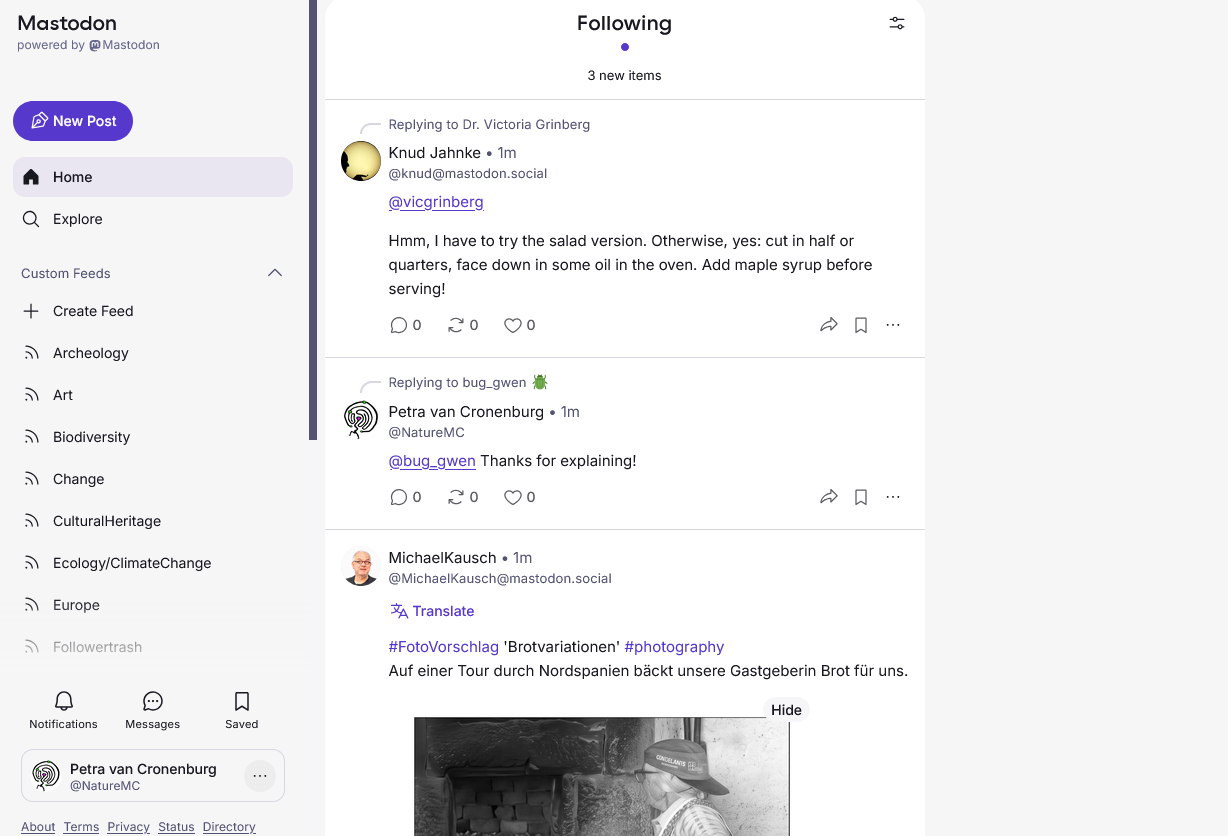
    Sudden new version. Feed with very small writing in the middle, at the right white emptiness. At the left the menu (I mostly don't use) ... and hey, where is the field for posting? I have to click "new post" first, then get a pop up which is extremely small. It sit's at the right bottom of my screen now, ergonomically a horror. And the icons are less visible, too.
For notifications which were an important feed for me, I have to search the very small icon at the left bottom.
What a crap!
    💬 1🔄 4⭐ 3

Replies