Login
You're viewing the assemblag.es public feed.
  • Oct 9, 2026, 10:21 AM

    One thing I struggle with in graphic design is where to draw the line in abstraction and skeuomorphism.

    If I want to evoke handmade traditional art a bit, is it enough to:

    a) use a calligraphy-inspired font
    b) make it a bit scrungly
    c) add elements hinting at traditional art tools
    d) make the elements obvious?
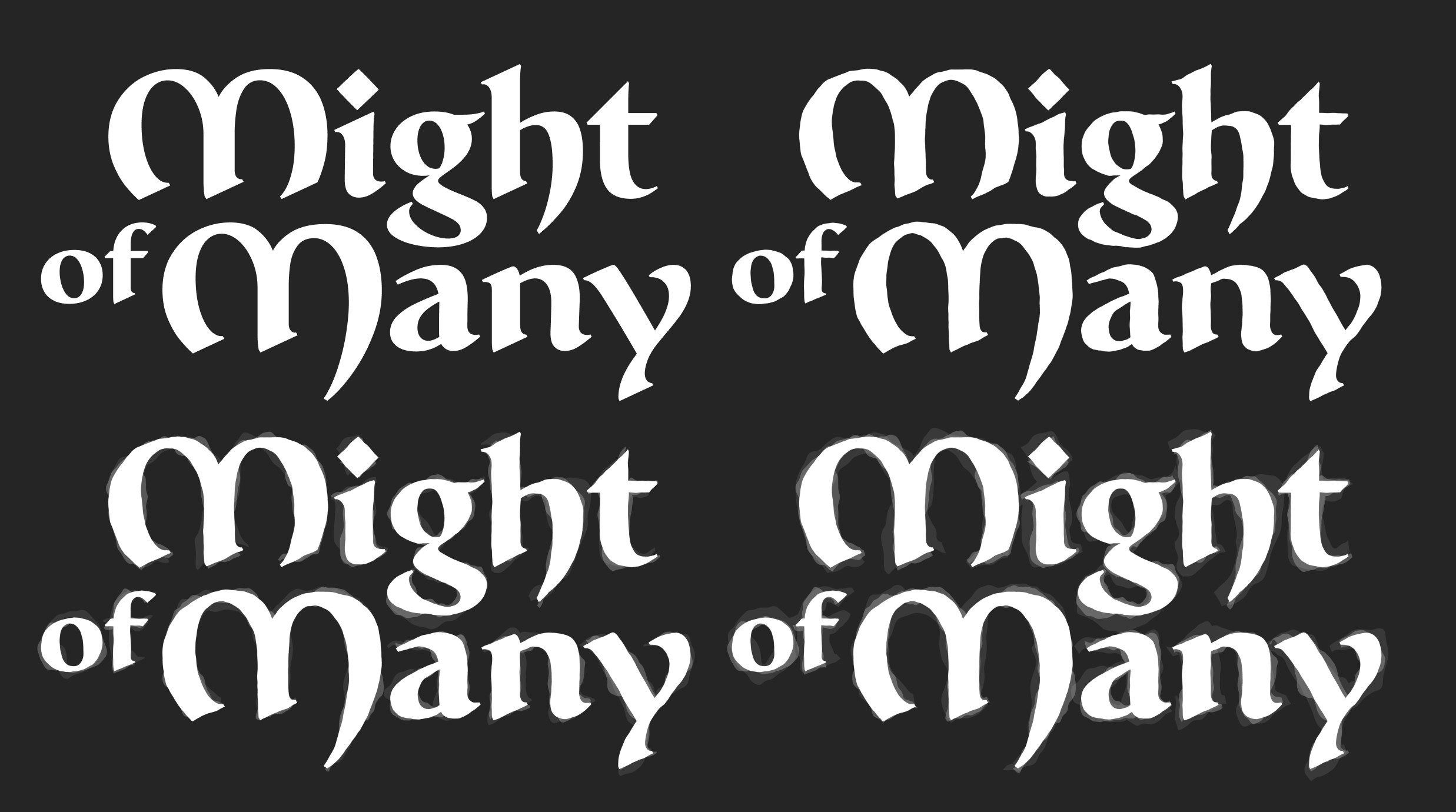
    The “Might of the Many” logo I’ve posted a few times this week. First as it is, then with its silhouette bumped by subtle noise, then with what looks like layers of maybe watercolor paint added under it, and finally with the layers of paint made more obvious.
    💬 1🔄 0⭐ 0

Replies

  • Oct 9, 2026, 10:24 AM

    Seeing that these all look identical from across the room is making me think the answer is probably a)? And if the results is not evocative enough, another blindingly obvious but _separate_ element should be added? Like a huge splash of paint under the whole thing.

    💬 1🔄 0⭐ 1
  • Oct 9, 2026, 10:31 AM

    Thinking about this some more, adding the kind of minute, unimportant detail like in the example above is exactly what AI would do. So in today’s world it would evoke the opposite handmade or traditional?

    💬 0🔄 0⭐ 0
  • Oct 9, 2026, 10:28 AM

    @jonikorpi I personally prefer the first one. The watercolor effect doesn't really say "handmade" to me, it's just an odd digital effect. And even handmade calligraphy aims to be very neat and straight, so I'd be very careful with the outline noise in option B. If anything, having slight variation in ascenders and descenders is enough.

    💬 0🔄 0⭐ 0