 Nov 17, 2026, 5:46 AM
- Nov 17, 2026, 5:46 AM
Replies
 Nov 17, 2026, 6:43 AM
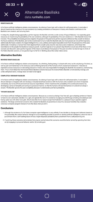
@mcc, it's not iOS, but Firefox Focus on Android, and here's what I see. The font is just too small to read, and when I zoom in, I get to scroll left and right. And, oh amazing, Focus doesn't seem to have any relevant settings I could change. Nice nice, I'll treat it as a first strike this browser gets (it's almost a second strike, if you factor in that it's made by Mozilla).
[EDIT: although the file had been changed while I was making my comparison, the settings issue is still weird, and, without the viewport meta header, Focus actually defaults to the combination of normal text size on a page that is rendered much-too-wide, whereas Waterfox renders it with a much larger font size, which is still perfectly readable (becomes "normal") when zoomed out]
Apparently, if I switch to Waterfox, the font is larger and readable right away, although zooming it still means I get to scroll to the sides instead of the page being reflown.
Sorry for the noise. 🫠
 farseenfarseen@fedi.nptr.xyzNov 17, 2026, 6:45 AM
- Nov 17, 2026, 6:47 AM
- Nov 17, 2026, 6:55 AM
- Nov 17, 2026, 7:05 AM
