
Amy Worrallamyworrall@mastodon.social
Nov 10, 2026, 5:58 PMTrying a version with proper NSTableView columns. Do the alternating row colours affect being able to visually scan the colour swatches?
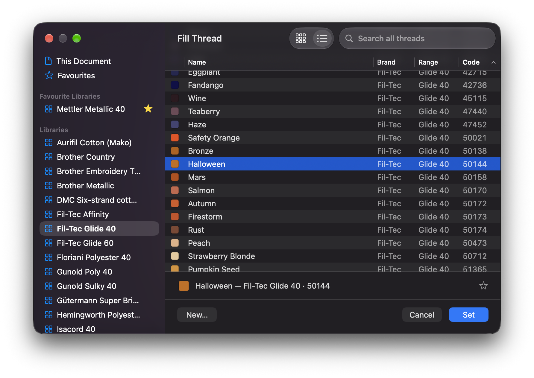
Trying a version with proper NSTableView columns. Do the alternating row colours affect being able to visually scan the colour swatches?

@amyworrall That's a difficult one. Personally, I much prefer the look of the NSTableView version, it's much easier to visually scan the entire line and the columns. But yeah, there's a case to be made that the alternating background colour might mess with colour perception when comparing two similar swatches.
Does the UI toolkit give you the ability to make the background colour of the cells / column for the swatches a different colour?
 Nov 10, 2026, 6:12 PM
@amyworrall Personally I always find that alternate row colors improve row content view and selection.

@amyworrall perhaps stop the background short of the swatch, so all swatches are on the same ground.

@amyworrall Would it be possible to render the color swatch as rows of embroidered thread rather than a solid color? Could give a better idea of what to expect.
@amyworrall Also, adding some padding around the swatch to form a well with a constant background may make visual identification a lot easier as the eye will compare it to that rather than the row background.
@dimitribouniol it’s possible — I do have thread rendering in my canvas! (It’s not as good as I want it to be yet…)
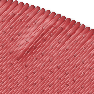

@amyworrall clearly better. Also NSTableView won’t suck at drag’n’drop

@amyworrall The zebra striping is a welcome addition. For various reasons it acts as an affordance for certain people and definitely makes it easier to associate the right most columns with the left.