 Aug 31, 2026, 9:14 PM
- Aug 31, 2026, 9:14 PM
Replies
 Ian Tindaleu0421793@toot.pikopublish.ingAug 31, 2026, 9:53 PM
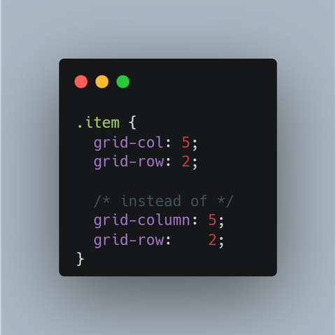
@css@front-end.social I don’t like that sort of thing - col isn’t a thing, it looks to me like an abbrev, but who knows what it is an abr of - colour, colonel, colon, cold, colostomy
- Aug 31, 2026, 10:03 PM
@u0421793 it's not "col", it's "grid-col" and there is a context so it's impossible to be an abbrev of any word you listed because none of them make sense in that context.
btw, we use "flex" which is the abbrev of "flexible"
- Ian Tindaleu0421793@toot.pikopublish.ingAug 31, 2026, 10:13 PM
@css@front-end.social I had no idea it meant flexible actually! That’s news, thanks
 Amelia Bellamy-RoydsAmeliaBRSep 1, 2026, 2:23 AM
- Ian Tindaleu0421793@toot.pikopublish.ingSep 1, 2026, 5:07 AM
@AmeliaBR@front-end.social @css@front-end.social indeed, and this shouldn’t have been the case either - col isn’t a thing. Really, abbreviating should be banished, it’s unfriendly and unhelpful. I don’t mind abbreviating for my own purposes, ie if I jot something down on a piece of paper as a note, and I’m the one who will read it later, that’s where an abbreviation is appropriate. But I really take great exception to having abbreviations escape into the wider world, it is an ill, and only serves to keep in-groups barriered in, and outside people outside. It is bad.
 spartanatreyuspartanatreyu@mastodon.socialSep 1, 2026, 3:14 AM
Example:
```
grid-░░░░░░: 3;
grid-░░░: 3;
```Counterpoint 1:
Keeping the widths different makes it easier to pick the right one while bleary-eyed.
Counterpoint 2:
People get column and row confused, especially while trying to learn/relearn. Column is set to 3. Does that mean there are 3 columns or that each column has 3 things in it?
Easy way to remember: "column" is wider than "row", so column controls the grid's width. (or x-axis density when grid can't grow wider)
 toptop@norden.socialSep 1, 2026, 9:38 AM
@css
“grid-column” and “grid-row” are already shorthand forms of the CSS properties ending in “-start” and “-end.” Should there then also be a “grid-col-sta”? 🥴I think it would make more sense to combine the two properties. For example:
“grid-column-row: 1, 2;”
“grid-column-row: 1 / 3, 2 / -1;”- Sep 1, 2026, 10:06 AM
@top we already have a property that combine both "grid-area"
- toptop@norden.socialSep 1, 2026, 10:22 AM
@css
Oh, you're actually right. In my defense, though, I have to admit that I rarely use “grid.”  mdavismdavis@mastodon.socialSep 2, 2026, 7:39 PM
@css You’re probably right. I think colgroup came first and established “col” then, yes?