Mindaugas Rudokasmrudokas@mastodon.social
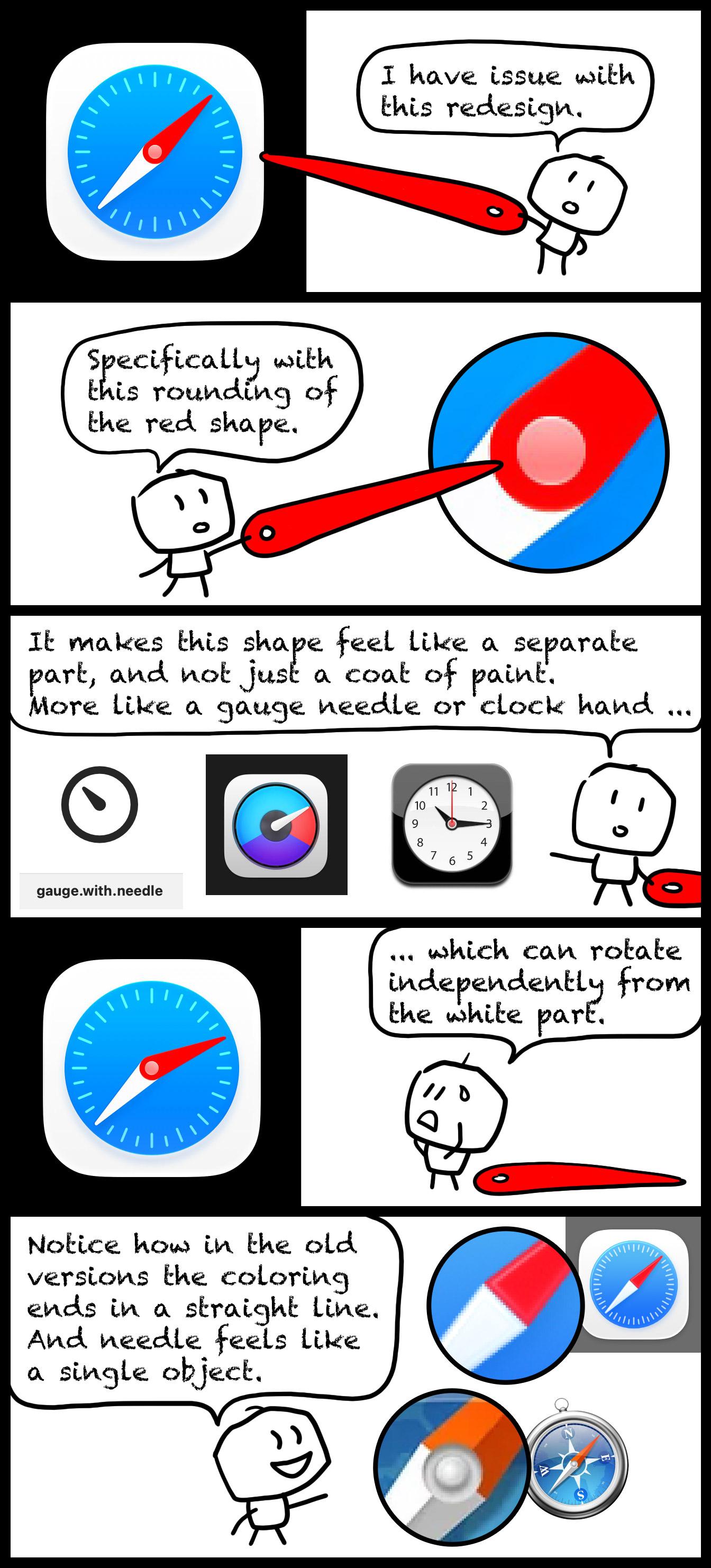
Aug 17, 2026, 3:44 PMIn the name of practice of communicating design concepts more clearly to the wider public, I have redone the graphical part of the explanation of what (in my eyes) is wrong with the new Safari compass (27 beta). Hope this is much clearer.
Please, Apple, can we change it to different solution! 🙏