Stef Walterstephaniewalter
Aug 19, 2025, 8:20 AMThere’s no such thing as inaccessible colors. It’s all about combinations. Yes, even yellow! And purple.
I love yellow (have you seen my hair?) and purple (have you seen my palette?). Together, they prove you can design vibrant, accessible palettes with so-called “tricky” colors.
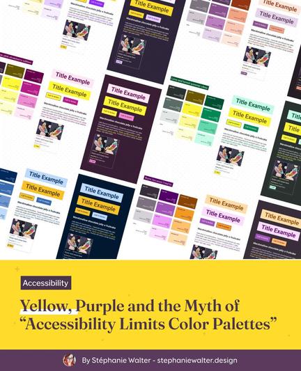
I debunk the myth that “accessibility limits color choices” with 6 WCAG-tested palettes that prove creativity and accessibility can go hand in hand. Full tutorial + video.