Duncan Horneduncandesi9n@mastodon.design
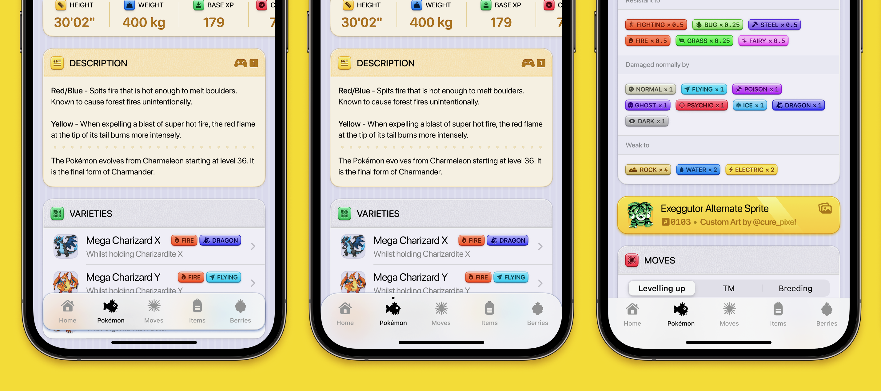
Feb 4, 2025, 11:30 AMI’ve been thinking that the default iOS tab bar and navigation bar are starting to look a little out of place in my more tactile ui for Dexie, so I’ve been playing around with some different ideas.
I like the idea of the of the first concept, but it does look a bit busy with content being shown below it. Maybe it would look better being slightly wider than the cards to avoid confusion. However I think the middle option is just enough of a change to fit the aesthetic the ui has.