Login
You're viewing the clockwork.monster public feed.
  • Nov 16, 2026, 4:04 PM

    Reading some C++ code, I quickly jotted down an expression or two on paper so that I'd remember it when I went to the other end of the file to compare it with something else. (Yes, I still keep pencil and paper by my computer, I'm old-fashioned that way.)

    The expression involved the && operator, which is a pain to handwrite. One & is complicated enough; two are just ridiculous. I idly started trying to doodle a joined-up glyph that combined two of them.

    About 20 attempts later, tada! I present the "ampersampersand".

    You can handwrite it in a single stroke, but it's tricky at first, because the two upper loops have to be drawn in opposite directions. But even so, it's quicker to write than two separate ampersands.

    Now I'm half tempted to draw a version for my personal font and add it as a ligature to see how that goes.
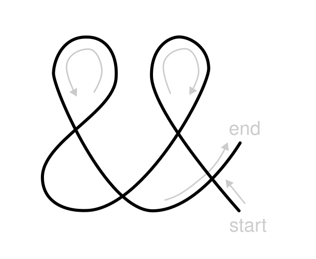
    A handwritten glyph with the appearance of two ampersands (&&) smushed together into a single smooth curve, so that the two trailing ends of the left & become the left-hand side of the bottom loop of the right &. Arrows in light grey, plus the words 'start' and 'end', indicate the intended direction of the single stroke that draws the whole symbol.
    💬 2🔄 26⭐ 45

Replies

  • Nov 16, 2026, 4:15 PM

    @simontatham By analogy with the tenor clef — which can either be a treble clef with an 8 below or a doubled treble clef — how about an ottava bassa ampersand?

    ottava bassa treble clef / doppio treble clef // ottava bassa ampersand / doppio ampersand
    💬 0🔄 1⭐ 2
  • Nov 17, 2026, 1:53 PM

    @simontatham Oh I like his! This would make a lovely ligature to see not just in C code, but any lang that uses the C-style && for boolean intersection.

    💬 0🔄 0⭐ 0